Artwork in Focus: Helen Frankenthaler’s Madame Butterfly (2000)
In 2000, Helen Frankenthaler (1928-2011) made Madame Butterfly, a work of transcendental and uplifting beauty. Amongst Frankenthaler’s most successful woodcuts, Madame Butterfly was lauded by the curator Jacklyn Babington, as ‘the jewel in Frankenthaler’s crown’ and a woodcut which ‘truly transforms the possibilities of the medium’.
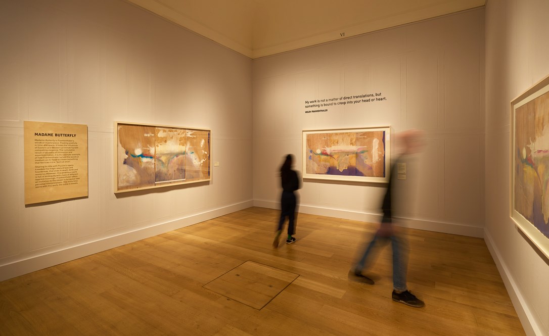
Madame Butterfly holds pride of place within Dulwich Picture Gallery’s Helen Frankenthaler: Radical Beauty: the work fills the exhibition’s final gallery. Madame Butterfly is both celebrated in its autonomy and acts as window onto themes in Frankenthaler’s work explored elsewhere in this exhibition. Most notably, Madame Butterfly powerfully attests to Frankenthaler’s interest in collaboration, innovation, and ambiguity.
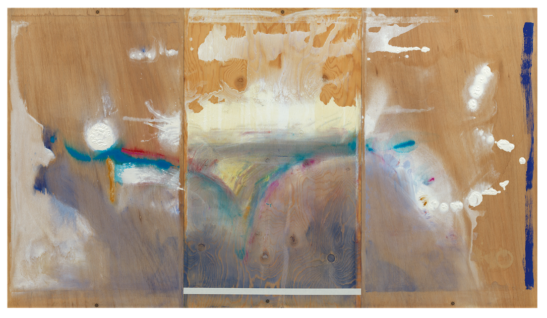
Helen Frankenthaler, Madame Butterfly, 2000, Painting on three panels of wood, 121.9 x 214.3 cm, © 2021 Helen Frankenthaler Foundation, Inc. /ARS, NY and DACS, London/ Tyler Graphic Ltd., Mount Kisco, NY

In its structure, technique and title, Madame Butterfly evokes Frankenthaler’s interest in Japanese woodcuts. The woodcut’s triptych format is a direct reference to the structure of a silk-screen which Frankenthaler purchased in Kyoto, Japan, in 1983. During this trip to Kyoto, Frankenthaler learned the traditional Japanese woodcut technique of ukiyo-e printing, used in Madame Butterfly and several other prints in Dulwich Picture Gallery’s exhibition, such as Cedar Hill (1983).
Ukiyo-e, which can be translated as ‘floating world’, is a method of water-based printing with vegetable inks. Working with the master woodblock carver and printer Yasuyuki Shibata at Tyler Graphics Ltd., in Madame Butterfly Frankenthaler invokes the ukiyo-e technique to create gossamer layers of colour and ‘floating’ forms which appear suspended in space. Meanwhile, the work's title has been interpreted as a reference to Giacomo Puccini’s opera Madame Butterfly (1904), a tragic love story focussing on the experience of a Japanese woman named Cio-Cio-San.
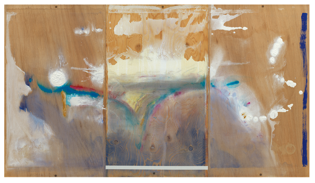
Helen Frankenthaler, Madame Butterfly, Working Proof 1, 2000 Woodcut proof with collage and hand additions on three sheets of light sienna (centre sheet) and sienna (left and right sheets) TGL handmade paper, 106.7 x 201.3 cm, © 2021 Helen Frankenthaler Foundation, Inc. /ARS, NY and DACS, London/ Tyler Graphic Ltd., Mount Kisco, NY
Madame Butterfly was Frankenthaler’s final collaboration with the Tyler Graphics Ltd. workshop. Frankenthaler began working with Kenneth Tyler in 1976: their longstanding professional relationship and shared commitment to technical innovation was central to the development of Frankenthaler’s woodcuts. For example, in Frankenthaler’s early woodcut Essence Mulberry (1977), included in Dulwich Picture Gallery’s exhibition, Tyler used the blend roll technique to create a remarkable painterly-gradation of colour.
Madame Butterfly represents the culmination of Frankenthaler and Tyler’s technical achievement. Constructed from 46 woodblocks, two different types of paper, printed using 102 specifically mixed colours and measuring over two metres in length, Madame Butterfly reimagines the possibilities of woodcut. While woodcut was traditionally associated with the ridged surface, harsh lines and static shape, Madame Butterfly is soft, fluid and delicate. To create the works’ remarkably soft-surface, Frankenthaler used a technique she called 'guzzying’. ‘Guzzying’ involved distressing the surface of the woodblock with an array of tools including sandpaper, cheese scrapers, and dental tools to create a velvety optical texture.
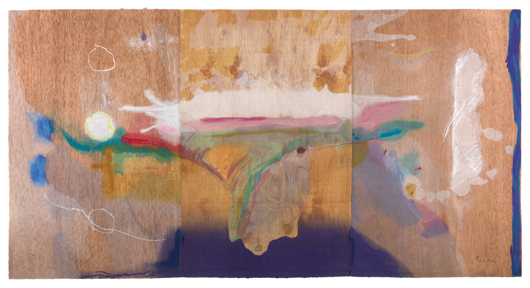
The final work: Helen Frankenthaler, Madame Butterfly, 2000 102-colour woodcut from 46 blocks of birch, maple, lauan, and fir on one sheet of light sienna (centre sheet) and two sheets of sienna (left and right sheet) TGL handmade paper, 106 x 201.9 cm (triptych), © 2021 Helen Frankenthaler Foundation, Inc. /ARS, NY and DACS, London/ Tyler Graphic Ltd., Mount Kisco, NY
Ambiguity is essential to the experience of Frankenthaler’s woodcuts. In Madame Butterfly, abstract forms and veils of pastel colour move in and out of focus - the viewer's eyes are engaged in a dance with the woodcut’s complex and ever-changing composition. This effect is accentuated by Frankenthaler's choice to print onto brown-tinted coloured paper and the process of accentuating the grain of her woodblock. Frankenthaler stages a trompe-l’oeil: it is unclear where the surface of her woodblock ends and her print begins. Madame Butterfly also visually plays with the boundaries of woodcut and painting. Looking at the work one could easily mistake it for one of Frankenthaler’s monumental abstract paintings, created using her signature soak-stain technique, or a watercolour created from vaporous washes of pigment. Gestures are candid and expressive: colours appear to bleed into one another or splash across the surface of the print in a remarkable display of dynamism and spontaneity.
In an interview with the art critic Barbara Rose, Frankenthaler stated that ‘a really good picture… looks as if it were born in a minute’. However, this sense of spontaneity is only an illusion. Madame Butterfly ‘looks’ dynamic, luminescent, playful and ambiguous, yet is created through an innovative and meticulous process.
Cora Chalaby is a PhD candidate in History of Art at University College London. Cora’s research explores American abstract painting by women during the 1960s and 1970s, focussing on the work of Helen Frankenthaler, Joan Mitchell, Howardena Pindell and Alma Thomas.
@corachalaby