Unearthed At Home: Photography Competition - The Winners
Thanks to everyone who took part in our #unearthedathome photography competition - we received over 230 entries and the standard of work was unbelievably high.
Our judges were the curator of Unearthed:Photography's Roots Alexander Moore, Eleanor Sutherland from our media partner for the exhibition, Aesthetica Magazine and Joy Gregory, who is one of the contemporary artists featured in the exhibition. We've featured the winning entry along with the runners up below, with insightful comments from the photographers and judges.
The Winner

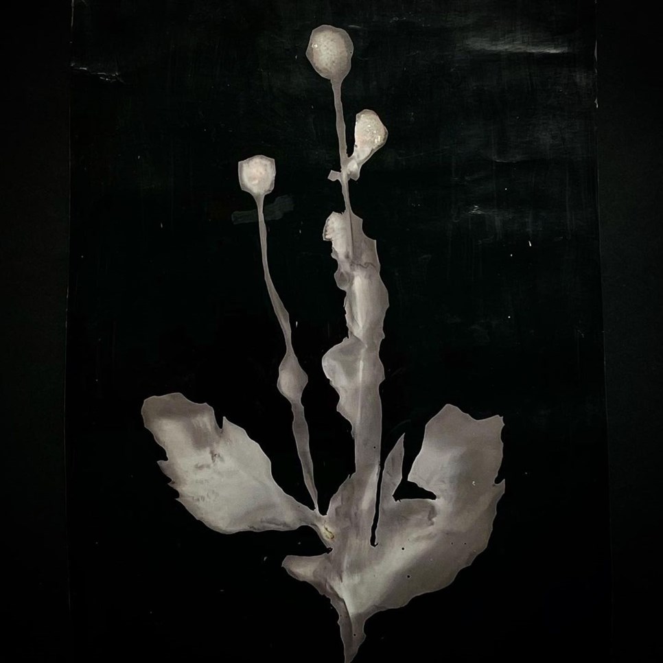
The winning entry was this mysterious image by artist Eileen White. Here's what she had to say about it:
This piece was made using a camera less technique, often referred to as ‘lumen printing’. It is similar to making a photogram in the darkroom, the difference being that this method uses only sunlight, the plant, time and a piece of black and white photographic paper. The entire process is mindful and respectful of the environment, by minimising the use of harsh chemicals as well as bringing attention to our current tendency towards ‘plant blindness’.
Alex: I was fascinated by how this mysterious still life was made. It appears to me as though it could be a digital scan, or some kind of infographic artwork and at the same time is reminiscent of the earliest cameraless photograms. I’m very interested in this sphere where old meets new.
Joy: I was also really intrigued by the image and imagined it to be born of technology yet to be invented. I was very surprised to find it was a lumen print which somehow had been made black-and-white. I was very attracted to this image because of its otherworldliness and its unique appearance which made it stand out from the other submissions.
Eleanor: White’s image is so intriguing. It combines analogue and digital aesthetics to create a strong sense of contrast and texture. It leaves the viewer wondering how, and when, it was made. A single plant is brought into sharp focus – evoking the worlds of scientific study, historical archiving and 3D mapping.
Runner up #1

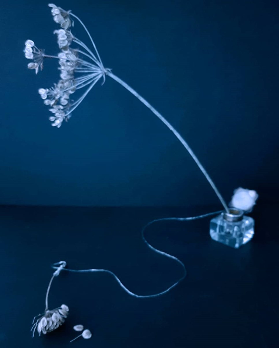
Here's what @metamorfosi had to say about her intriguing runner up, titled 'Stillness": I am a huge fan of cyanotype, hence the blue tone of this picture. Throughout this pandemic, I wanted to try and evoke a sense of calm and for the viewer to catch their breath. The picture was taken with my Samsung galaxy 7 mobile phone...
Joy: The blue and plant form brings to mind the simplicity of the Anna Atkins 19th-century photogenic drawing but when you deeper into the image you can see that it is a composite of plant and a man-made object in the wiring of the electrical wiring. The work appears to straddle the 19th, 20th and 21st centuries cleverly combining the sensibility of cyanotype with the playfulness of late 20th-century advertising composites alongside the complexity of today's digital imaging.
Alex: In great contrast to the two dimensional realm in which Anna Atkins worked, this photographer has made perspective central to their image – to the extent that I almost felt it had a Surreal quality to it. I thought that the image was compositionally very successful despite only having a few elements to it which can be a very hard thing to achieve.
Eleanor: This striking blue image evokes the pioneering botanical cyanotypes of Anna Atkins, bringing them into the digital age. The composition plays with two-and three-dimensional perspectives, subtly combining delicate floral forms with industrial wiring.
Runner Up

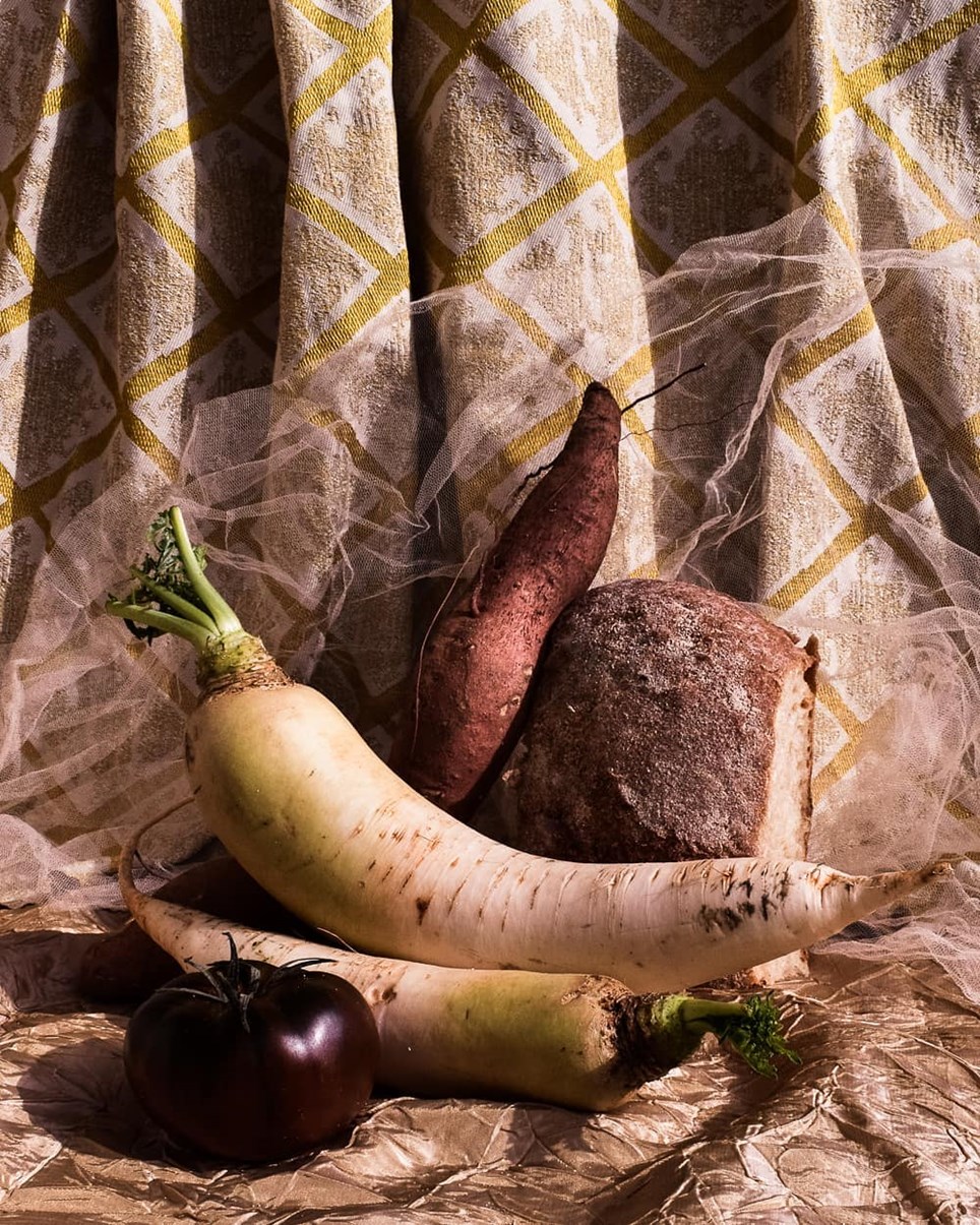
@GeorgiaMatsamaki said of her fantastic 17th-century still life inspired composition: This image is part of a photographic series called "You will meet a red plastic fork", made during the latest quarantine in Greece where I live. This series is an ode to food: vegetables, fruit, bread, everyday humble food. I got inspired by the 17th century paintings, and at the same time I tried to adjust this aesthetics to the contemporary standards.
Alex: This image represented much of what makes the classic still-life genre so enjoyable. It is really an honest celebration of the beauty which lies naturally within its subjects. I found it to be graceful and classically decorative but then its light and textures also made me think of travel and of equatorial heat.
Eleanor: Matsamaki’s composition has such an inviting, warm and rustic feel – mixing rough textures, natural forms and patterned fabrics. In this image, 17th century Spanish still life painting meets the rounded, cascading shapes of contemporary sculpture.
Joy: The colours and the objects from cells are seemingly straightforward but also very complex. The vegetables chosen are imperfect objects, and seem to be a celebration of individuality and simplicity.
You can view all of the online entries to the competition here.
With thanks to our Media Partner
![]()

